Colour Palette

The was a bit of confusion with the reds. Should I have 3 different reds (two of the multicooker reds and 1 maestro red) happening? My panel suggested I combine the Maestro red with the packaging red, and still the red was too dull, almost rust-ish in colour.
By changing it a bit, we settled on this colour palette with 2 reds, one being the Maestro red.
Packing versions
So obviously that did not end up being the final packaging.
Sorry I haven't really been updating my blog. I've been mailing my review panel my work as and when, and all the work has been driving me a little insane.
Anyway, point being, I did at least 13 versions of the packaging, until I found something I was happy with.
The feed back from the set in the previous post was- that it was too loud, too much happening, too busy.
So I tried other versions, trying to incorporate the positive negative space like I have in the logo.


The feedback I got on these was- it's still too busy. The green is a little over powering, and the motifs are too big.
In the mean while, i was also trying to use the motifs differently as well as just trying the first design in different shades of green etc etc
Then I chose to work more with the playfulness of the positive negative spaces I had going in the motifs of the vegetables, and my client didn't want me to restrict myself to just mainly.. well.. peppers, so I chose to incorporate other vegetables too. And I thought I had a final packaging idea. Until... I decided to try a different colour palette.


The reason I decided to change my colour palette was because it was still too green, and the feel of what the product does wasn't coming across.
Thanks to some help (thank you sneha! If you're reading this) I found a new colour palette that suited the concept better.
It showed variety, like the cooker that does multiple things, and the colours were very vegetable like, and the entire packaging came together way better.
Although it took a little convincing, my clients agreed that this DID stand out more.


Moving on to the packaging
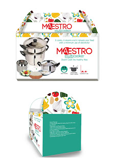
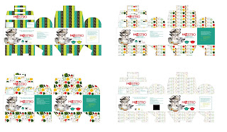
Trying to make the product look young, attractive, simple yet put the point across and pointing out that it does multiple things, I chose to use vector based graphics more or less for the look and feel.
When ever I'd sit down with my clients, they constantly said- we want our product to be the hero.
Which is also why the product is the only 'image' in the packaging really.
This isn't the FINAL FINAL design yet, there is a lot of tweaking to be done, but here are my ideas anyway.
'multicooker'
I felt like 'multicooker' needed to have a little identity of it's own, while my clients felt like they didn't want there to be a fight better the look of 'multicooker' and 'Maestro' they wanted it to go together, and if possible, the brand to stand out a little more.
I put a few options before them, and they went for the simpler one.
Which is the last option in this image. It stresses upon the fact that this cooker does many things. Unlike what people generally assume, which is that it makes just rice.
For some reason, I wasn't getting the execution of the 'steam' just right in the other options. And when clubbed with the Maestro logo, there was NO WAY to make it look cohesive.
I liked the bubble options too. Ah well.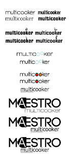
Moodboards for the multicooker

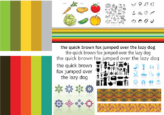
In the first mood board, I have tried to put together everything I thought was healthy, and steam cooked. I just wanted to see the different ways I could interpret it.
The second mood board was more narrowed down ideas, of look and feel. Colour, typography and execution.
From the surveys we found that currently the multicooker caters to an older audience, I needed to find a way to make it more young and fun. Yet bring the idea of health across.
The clients have been clear that they want something on the cleaner side and not necessarily indian, as they also export to other countries like the United states.
Logo Finalised
Finally, after a few font changes and tweaks to the plug and the type, HERE is the final logo for Maestro.
The font I have used is Code, bold. And the 'A' has been tweaked a little from the original font.
Final Logo Options
After a little bit of tweaking and font changes, here they are.
The first slide is of the variations in font etc, and the ones after are the colour options.
As you can see, the palette is pretty much decided on, now it just needs to be seen which one suits the company best.
Final Logos
Logo options narrowed down
Logo Options
From all the options I showed my client, they narrowed the ones they liked and felt might work to these.
I then showed this to my panel, and they liked the 2nd 4th and last option, which I need to tweak a little and after consulting with my client, I will have a logo, FINALLY. =)
For appliances with an edge

I have stuck to simple type here, but I have used the concept of 'appliances with an edge' and given an edge to the otherwise rounded O.
Experimenting with Type

With the help of the type I have used, I have again tried to bring about the feel and concept that the company is aiming for, which is- user friendly and customer satisfaction.
This has been done with the help of the rounded letters, and the playful twist on the 'A' and 'E' as well as a the use of positive and negative space.
Smile Options
The ones that work
As I have mentioned earlier, the company aims to give their customers complete satisfaction and convenience with their products, to bring a smile to their faces. Here are some of the iterations I feel work, especially the one at the bottom center.
Here are a few that didn't quite work...
Connecting with the customer/ Customer satisfaction
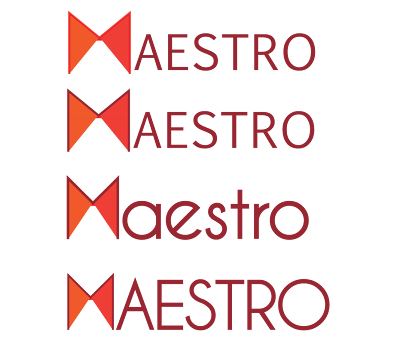
Thinking about how my client wants to express how Maestro is a lot about service, and satisfying the customer, how their relationship just doesn't end once they've bought the product, and after sales service is important to them too.
They want to be connect to their customers, they want them to know that their convenience and satisfaction is what Maestro always has in mind.
I've tried showing that connect here, by connecting these 2 triangles of the 'M' also giving it the look of an abstract bow-tie. Like a Maestro.
The Handshake

When you agree on something, you shake hands, it's the first thing you do, it's a promise, its to assure the other person, its professional. It's about making a connection.
Again, I'm trying to be in sync with what my client wants to show when they talk about Maestro.
Ideas Ideas

I'm struggling with idea. It looks better in my head, and less bookish.
Now that I've said it, you probably think it looks like a book too. Gah!
I'm trying to bring in perspective to show that maestro has other sides to it too, it's not just another 'steam cooker company'. It's interesting, it's got all these sides to it, whatever appliances they come up with are not your usual normal appliances, they have this other side to them, this other perspective.
Even if I go for just type, could I work on it differently, to make the logo fun and interesting, to make people wonder what Maestro is about?
I doubt my client would agree... but it's just a thought.
Some more Electrical Ideas

Forgive me for being a little hung up on the plug idea, but every time I think of another way of working on it, I choose to explore it and promptly put it up.
I'm not sure how far this works, I think it might be too thin. But I really like the font on the second option its called- hlmt.

I have always thought that a socket reminds me of an 'A' without the line in the middle.
I used to try connecting the dots on all the plug points I came across as a child, with whatever writing material I could find, where ever I went. Much to my parent's annoyance.
Blame it on connecting the dots OCD. =P
Plugs part II

The first logo in this set look a little like Maestro's current logo font. But I feel like it's a little more simplified.
The one I like the most from this lot, is the last one. I like this font, as well as the way the plug looks. It is a good fit.

Here I've tried intergrating the plug into the type.
I'm just putting all my ideas out there, and some might be a hit, and some might be a complete miss. But at this moment, I don't want to give up on any one idea I have without even trying it out.
Plugged in
So the plug idea was liked, but needed to be worked on some more.
Here are some different kinds of treatments to the plug. Hopefully making it look more plug-like. I'm going to ask around tomorrow and see what works and what doesn't. But for now, here they are.

Here are some font options using the basic idea of the plug. I initially thought that an all caps would work better with the strong 'm' but I also like the title case of the same.

The of course, I decided to have some fun with it, I know stuff like this will probably never get chosen, but I had to try, right?
What if I drew the 'm' and gave the entire thing a whole hand done feel. I know most appliance companies don't go for a more personal look, but I don't see why not.
It give more personality to their brand I feel.
Anywhoo, so I went ahead and did this.

With font options even.
Client feedback on the first set of ideas
After going through my ideas so far, my client felt that for their logo, they really wanted to focus on the name, and make the image/symbol associated with the logo secondary.
Being fairly new in the market they feel like their brand awareness will increase when more people recognize them by their brand name. When a person walks into a shop, they ask for a product of a particular brand and that is why, it should stand out.
Like for example- Philips, Samsung, Braun, Panasonic, Preeti to name other appliance brands are ones that focus on the name, on the type.
Any other element can be PART of the name, but not separated from the lettering, is what they feel.
As far as their current logo goes, they feel like the type is too weak, and can't be read clearly when reduced.
This is a fair concern, and I shall keep it in mind.
First go

I like the idea of using a smile in the logo. It has to be subtle, but something you get on second glance. For that, I think using a serif font might be necessary. Or maybe even not. I shall have to test that out.
Here is just the first set I have executed, it needs to be ironed out some.

For this idea, I feel like the 'm' needs to be something distinct so that the inside can be filled with different patterns or textures, depending on which way the company branches out, and the logo will still be applicable to it.
Over here, it's bubbles because that's what steam in steam cookers generate. I have tried out different kinds of bubbles, some with a little opacity, some with none.
I think a fully lower case font makes it less formal and more approachable in this case. Which is what the company aims for.

Here are a couple of ideas/executions that aren't quite there yet.
I like the first 'M' I like how friendly, and round it is. It might actually work with the look the brand is trying to go for. (friendly, affordable etc)
The second option is where I am trying to get the 'electric plug' idea to come across, I'm not sure how much it does right now but if I could get it to look just right, with a fitting font, I feel it might work.
Ideas in pencil
So the words most common were- convenience, electricity, easy to use etc.


Words that come to mind
When asked to describe a home appliance
status symbol
Electricity
Modern
Let's talk brand architecture.

Maestro wants to be portrayed as an appliance brand that is user friendly. That their after sales service, will not let their consumer down, and that the customer-dealer relationship doesn't just end at the store.
I have some ideas brewing in my mind as to how I can use this in my branding, but I must admit I'm still a little stuck about how to proceed. How can I SHOW appliances in a logo, how do I put all this across...
What is in a logo?
I have been going through the book- Design Matters// LOGOS by Rockport publishers.

If I have been a little stuck about what next, this book has certainly held my hand and shown me the way, so to speak.
I have been making some notes on points I'd like to keep in mind while designing the logo. And here they are. If they are a bit jumbled or repetitive, excuse me.
Just like ancient ancestors communicated through visual icons, modern brands speak to customers through imagery.
Visual icons communicate basically and directly which is perfect for branding, when the goal is to convey a message with minimum time or strain on the audience. Logo design, however, is about cutting the message to the quick.
Logos send messages of all sorts to mixed audiences. They shorten the communication of a complex statement to something simple, clear and concise. They replace written language when audiences don’t have the time or will to read.
A logo design visually represents brands in market places. The result should be a logo design that not only translates the brand but also does it quickly and memorably for the audience.
A logo is a powerful weapon. It can boost consumer perception, it can boost internal perception. What the logo cannot do is actually make the company great. It can and should be the flag that signals brand change. An example of this is the amazingly effective pull of McDonalds.
The logo is a flag. The guts of a brand reside in the consistent qualities and values of the people in the organization.
Logos are more important than ever, because they make sure the brand is still connected to the story. In a world where intergrated marketing communications are trampling advertising’s outmoded methods, logos are an essential linking agent.
Consumer brands speak through advertising, the internet and packaging.
If branding was a book, a logo would be the cover. If your logo is speaking to an audience, what is it saying? What do the colours say about the brand? What does the shape say? What does the type say? All these pieces come together and speak in a visual language about your brand.
The 3 elements of understanding any market place-
People
The kind of people that buy into the product, the kind of people you would WANT to buy into the product.
Objects
What is this object and brand about, how is it different from the others?
Culture
Includes belief systems, history and past patterns of behaviour that are glue holding objects and people together.
Since I am going to be branding MAESTRO, as the main brand, and 'multicooker' is going to be the sub brand, I have been really confused as to how I am going to do the 2 parts. I know that they (the clients) want Maestro to be prominent because they are thinking of branching out into other appliances in the future.
But I can denote all the things the steamer stands from in the sub brand, which is multi-cooker. That is as of now, left up to me to choose how I'd like to deal with it.
Do I just work on Maestro options first? Or do I work on both of them together? I'm not sure. I have a few ideas 'steaming' through my mind.
But first I need to get their brand architecture in place. And I hope to have a moodboard up on the multicooker as well.
Also, I'd like to thank Design Matters. =P
Time Line

Here is an estimate time line to help me get organized.
I have had a sit down with my clients and I know what they're looking for. As they've already said, their aim is to promote the concept of steam cooking through their product. Some other points were brought up too, which I shall put into my mood board, but for now I am researching a bit more on branding.
What do designers have to say about branding, how do they go about it? How DO concepts work? What do you look for?
So many questions and I have my work cut out for me. To the books!
Survey Results of Maestro Customers
From the survey of about 20 people, I can say that most of Maestro's customers, are above the age of 46, mostly home makers, and female.

77% of them found out about the Maestro through friends and relatives. And below are their reasons for purchasing the Maestro, as well as what they use it for.

As you can see, the highest rated reason is because they know steam cooking is the healthier way of cooking. When asked what features they liked the most here are the top four-
1.Food is cooked in a healthy way, retaining nutrients
2.Does not need constant supervision
3.Taste and texture of food cooked
4.Reheating of food
These answers give me and idea and direction as to what sells about the product, and what makes customers choose it over the others.
The final question asked was-

Saving gas is becoming increasingly important, especially with the talks about raising gas prices, and offering subsidized prices only on a limited number of cylinders provided to households per year.
For further information on that, please see- http://week.manoramaonline.com/cgi-bin/MMOnline.dll/portal/ep/theWeekContent.do?BV_ID=@@@&contentType=EDITORIAL§ionName=TheWeek%20Business&programId=1073754899&contentId=9746335
Results on the questionnaire for non-users
The total number of people that answered this questionnaire were 86 in number, I sent this survey out to as many people as I could, and asked them to send it to more people they might know. Aiming to get results from a mixed bag of people, which I think I achieved.
Here are the kinds of people that responded.

From the below graph we can see that the most important thing people want from their cooking appliance is Healthy food, as well as food that tastes good. Secondary is unattended cooking along with the price of the appliance, which apparently, isn't so important.

Here is their perception of a steam cooker... A majority of them feel like it retains the nutrients of the food, as well as is a more cost effective way of cooking.
However they still feel like the gas stove is the most economical to use.


And here are some final questions

Surprisingly now-a-days people would rather shop online (14%) as opposed to going to a dealer outlet (10.5%).
The information I have gathered from this survey gives me a better idea of what customers are looking for when they go shopping for an appliance, as well as what healthy, economical cooking is to them.
I have a feeling that most of them are still not aware of steam cookers and how they are different from rice cookers.
Total Pageviews
Blog Description
Archives
-
▼
2011
(33)
-
►
September
(15)
- Moving on to the packaging
- 'multicooker'
- Moodboards for the multicooker
- Logo Finalised
- Final Logo Options
- Logo options narrowed down
- For appliances with an edge
- Experimenting with Type
- Smile Options
- Connecting with the customer/ Customer satisfaction
- Ideas Ideas
- Some more Electrical Ideas
- Plugs part II
- Plugged in
- Client feedback on the first set of ideas
-
►
September
(15)
Followers
Popular Posts
-
Trying to make the product look young, attractive, simple yet put the point across and pointing out that it does multiple things, I chose to...
-
So the plug idea was liked, but needed to be worked on some more. Here are some different kinds of treatments to the plug. Hopefully maki...
-
I like the idea of using a smile in the logo. It has to be subtle, but something you get on second glance. For that, I think using...
-
Maestro wants to be portrayed as an appliance brand that is user friendly. That their after sales service, will not let their consumer d...
-
Finally, after a few font changes and tweaks to the plug and the type, HERE is the final logo for Maestro. The font I have used is Code, bol...
-
The ones that work As I have mentioned earlier, the company aims to give their customers complete satisfaction and convenience with their pr...
-
I have stuck to simple type here, but I have used the concept of 'appliances with an edge' and given an edge to the otherwise rounde...
-
From the survey of about 20 people, I can say that most of Maestro's customers, are above the age of 46, mostly home makers, and f...
-
After a little bit of tweaking and font changes, here they are. The first slide is of the variations in font etc, and the ones after are the...
-
Logo Options From all the options I showed my client, they narrowed the ones they liked and felt might work to these. I then showed this to ...


