'multicooker'
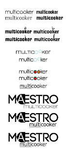
I felt like 'multicooker' needed to have a little identity of it's own, while my clients felt like they didn't want there to be a fight better the look of 'multicooker' and 'Maestro' they wanted it to go together, and if possible, the brand to stand out a little more.
I put a few options before them, and they went for the simpler one.
Which is the last option in this image. It stresses upon the fact that this cooker does many things. Unlike what people generally assume, which is that it makes just rice.
For some reason, I wasn't getting the execution of the 'steam' just right in the other options. And when clubbed with the Maestro logo, there was NO WAY to make it look cohesive.
I liked the bubble options too. Ah well.
Total Pageviews
Powered by Blogger.
Blog Description
Archives
-
▼
2011
(33)
-
▼
September
(15)
- Moving on to the packaging
- 'multicooker'
- Moodboards for the multicooker
- Logo Finalised
- Final Logo Options
- Logo options narrowed down
- For appliances with an edge
- Experimenting with Type
- Smile Options
- Connecting with the customer/ Customer satisfaction
- Ideas Ideas
- Some more Electrical Ideas
- Plugs part II
- Plugged in
- Client feedback on the first set of ideas
-
▼
September
(15)
Followers
Popular Posts
-
Trying to make the product look young, attractive, simple yet put the point across and pointing out that it does multiple things, I chose to...
-
So the plug idea was liked, but needed to be worked on some more. Here are some different kinds of treatments to the plug. Hopefully maki...
-
I like the idea of using a smile in the logo. It has to be subtle, but something you get on second glance. For that, I think using...
-
Maestro wants to be portrayed as an appliance brand that is user friendly. That their after sales service, will not let their consumer d...
-
I have stuck to simple type here, but I have used the concept of 'appliances with an edge' and given an edge to the otherwise rounde...
-
Finally, after a few font changes and tweaks to the plug and the type, HERE is the final logo for Maestro. The font I have used is Code, bol...
-
The ones that work As I have mentioned earlier, the company aims to give their customers complete satisfaction and convenience with their pr...
-
From the survey of about 20 people, I can say that most of Maestro's customers, are above the age of 46, mostly home makers, and f...
-
After a little bit of tweaking and font changes, here they are. The first slide is of the variations in font etc, and the ones after are the...
-
Logo Options From all the options I showed my client, they narrowed the ones they liked and felt might work to these. I then showed this to ...


