Connecting with the customer/ Customer satisfaction

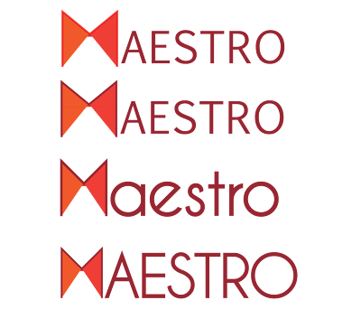
Thinking about how my client wants to express how Maestro is a lot about service, and satisfying the customer, how their relationship just doesn't end once they've bought the product, and after sales service is important to them too.
They want to be connect to their customers, they want them to know that their convenience and satisfaction is what Maestro always has in mind.
I've tried showing that connect here, by connecting these 2 triangles of the 'M' also giving it the look of an abstract bow-tie. Like a Maestro.
The Handshake

When you agree on something, you shake hands, it's the first thing you do, it's a promise, its to assure the other person, its professional. It's about making a connection.
Again, I'm trying to be in sync with what my client wants to show when they talk about Maestro.
Total Pageviews
Blog Description
Archives
-
▼
2011
(33)
-
▼
September
(15)
- Moving on to the packaging
- 'multicooker'
- Moodboards for the multicooker
- Logo Finalised
- Final Logo Options
- Logo options narrowed down
- For appliances with an edge
- Experimenting with Type
- Smile Options
- Connecting with the customer/ Customer satisfaction
- Ideas Ideas
- Some more Electrical Ideas
- Plugs part II
- Plugged in
- Client feedback on the first set of ideas
-
▼
September
(15)
Followers
Popular Posts
-
Trying to make the product look young, attractive, simple yet put the point across and pointing out that it does multiple things, I chose to...
-
So the plug idea was liked, but needed to be worked on some more. Here are some different kinds of treatments to the plug. Hopefully maki...
-
I like the idea of using a smile in the logo. It has to be subtle, but something you get on second glance. For that, I think using...
-
Maestro wants to be portrayed as an appliance brand that is user friendly. That their after sales service, will not let their consumer d...
-
I have stuck to simple type here, but I have used the concept of 'appliances with an edge' and given an edge to the otherwise rounde...
-
Finally, after a few font changes and tweaks to the plug and the type, HERE is the final logo for Maestro. The font I have used is Code, bol...
-
The ones that work As I have mentioned earlier, the company aims to give their customers complete satisfaction and convenience with their pr...
-
From the survey of about 20 people, I can say that most of Maestro's customers, are above the age of 46, mostly home makers, and f...
-
After a little bit of tweaking and font changes, here they are. The first slide is of the variations in font etc, and the ones after are the...
-
Logo Options From all the options I showed my client, they narrowed the ones they liked and felt might work to these. I then showed this to ...


