Moving on to the packaging


Trying to make the product look young, attractive, simple yet put the point across and pointing out that it does multiple things, I chose to use vector based graphics more or less for the look and feel.
When ever I'd sit down with my clients, they constantly said- we want our product to be the hero.
Which is also why the product is the only 'image' in the packaging really.
This isn't the FINAL FINAL design yet, there is a lot of tweaking to be done, but here are my ideas anyway.

'multicooker'
I felt like 'multicooker' needed to have a little identity of it's own, while my clients felt like they didn't want there to be a fight better the look of 'multicooker' and 'Maestro' they wanted it to go together, and if possible, the brand to stand out a little more.
I put a few options before them, and they went for the simpler one.
Which is the last option in this image. It stresses upon the fact that this cooker does many things. Unlike what people generally assume, which is that it makes just rice.
For some reason, I wasn't getting the execution of the 'steam' just right in the other options. And when clubbed with the Maestro logo, there was NO WAY to make it look cohesive.
I liked the bubble options too. Ah well.
Moodboards for the multicooker
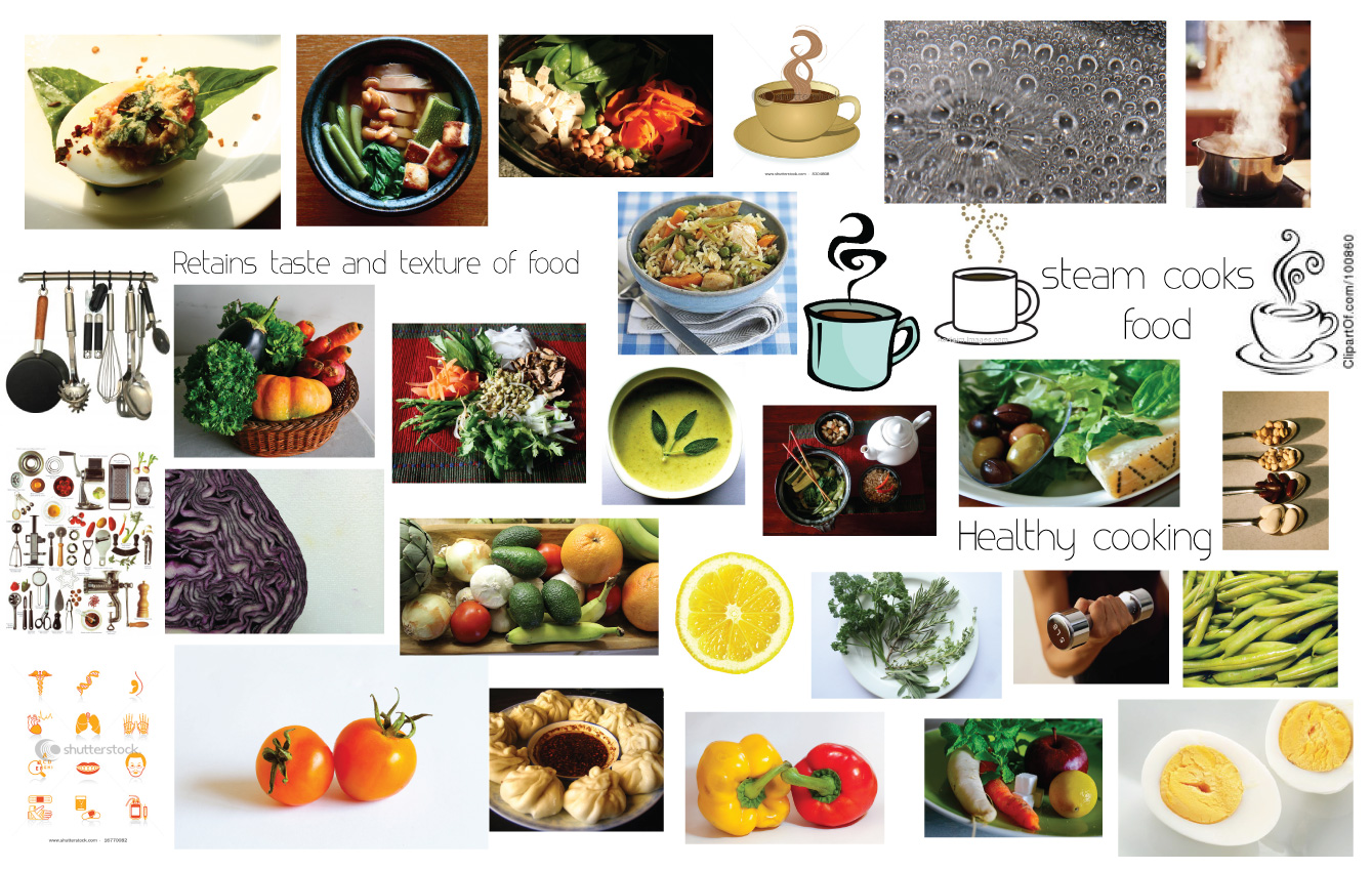

In the first mood board, I have tried to put together everything I thought was healthy, and steam cooked. I just wanted to see the different ways I could interpret it.
The second mood board was more narrowed down ideas, of look and feel. Colour, typography and execution.
From the surveys we found that currently the multicooker caters to an older audience, I needed to find a way to make it more young and fun. Yet bring the idea of health across.
The clients have been clear that they want something on the cleaner side and not necessarily indian, as they also export to other countries like the United states.
Logo Finalised

Finally, after a few font changes and tweaks to the plug and the type, HERE is the final logo for Maestro.
The font I have used is Code, bold. And the 'A' has been tweaked a little from the original font.
Final Logo Options
After a little bit of tweaking and font changes, here they are.
The first slide is of the variations in font etc, and the ones after are the colour options.
As you can see, the palette is pretty much decided on, now it just needs to be seen which one suits the company best.
Final Logos
Logo options narrowed down
Logo Options
From all the options I showed my client, they narrowed the ones they liked and felt might work to these.
I then showed this to my panel, and they liked the 2nd 4th and last option, which I need to tweak a little and after consulting with my client, I will have a logo, FINALLY. =)
For appliances with an edge

I have stuck to simple type here, but I have used the concept of 'appliances with an edge' and given an edge to the otherwise rounded O.
Popular Posts
-
 Forgive me for being a little hung up on the plug idea, but every time I think of another way of working on it, I choose to explore it and p...
 -
 Trying to make the product look young, attractive, simple yet put the point across and pointing out that it does multiple things, I chose to...
 -
 Maestro wants to be portrayed as an appliance brand that is user friendly. That their after sales service, will not let their consumer d...
 -
 I like the idea of using a smile in the logo. It has to be subtle, but something you get on second glance. For that, I think using...
 -
 So the plug idea was liked, but needed to be worked on some more. Here are some different kinds of treatments to the plug. Hopefully maki...
 -
 With the help of the type I have used, I have again tried to bring about the feel and concept that the company is aiming for, which is- user...
 -
 Finally, after a few font changes and tweaks to the plug and the type, HERE is the final logo for Maestro. The font I have used is Code, bol...
 -
 The ones that work As I have mentioned earlier, the company aims to give their customers complete satisfaction and convenience with their pr...
 -
 Here is an estimate time line to help me get organized. I have had a sit down with my clients and I know what they're looking for. ...
 -
 From the survey of about 20 people, I can say that most of Maestro's customers, are above the age of 46, mostly home makers, and f...
